![]()
In part 1, we examined how reference information differs from other learning content, the purposes it fulfils and the formats that it can take. We move on to explore best practice in terms of the presentation of the information.
General design guidelines
Reference information is different from other learning content because its purpose is to meet a short term need, not to have some long-term effect on the user. It does not need to engage the user, because you can assume that anyone who has made the decision to consult reference material is already engaged. It does not seek to stimulate thought or discussion. It does not need to assess the degree to which learning has taken place, because learning is not its purpose. You should have one simple aim in designing your materials: getting the user to the information they need as quickly and simply as possible and then presenting that information in such a way that it can be used immediately.
Here are some general tips that you can apply to any type of online reference material:
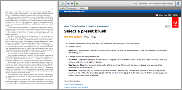
- Provide structured information, not prose: What works in a book, a report or a magazine does not work for reference. Very few people will read your material from beginning to end, if they read it at all. They will jump around and skim at lightening speed until they find what they are looking for. Long paragraphs of text are very hard to skim, so focus instead on using tables, lists and diagrams. If you must use prose, keep paragraphs and sentences short and focus on one point at a time. Use plenty of clear, descriptive headings. Leave out the anecdotes and witticisms.
- Be consistent: It is much easier to navigate information that is presented consistently. Choose a format for each type of information and use this every time. Adopt a typographical standard and apply this universally. Never vary your means for navigation. What should stand out should be important information such as rules and warnings. The only way you will achieve this is against a uniform backdrop.
- Ditch the numbering system: It is debatable whether elaborate numbering systems ever helped anyone to navigate a print document, but they are completely unnecessary and unhelpful online. Online information is accessed using search boxes and links. Numbers only get in the way.
Presenting factual information
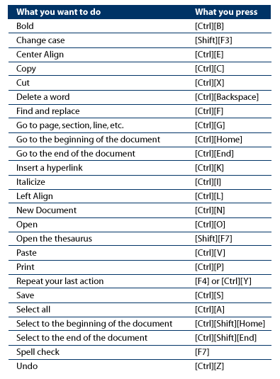
Factual information, such as names, dates, email addresses, spellings and codes, is best structured into databases or tables, and sequenced alphabetically, numerically or chronologically. As software becomes more intelligent, we will have less need for these tables; we should expect frequently-used data to be suggested to us automatically, based on our historical usage pattern and the particular context. But there will always be exceptions and we do not only need factual information when we using a software application.
Presenting concepts
According to Ruth Clark, a concept is a category of objects or ideas that is usually designated by a single word. Essentially when we refer to concepts, we are talking about the terminology which helps us to find our way around a particular knowledge domain. Without a common understanding of this terminology, we cannot communicate with our peers.
An example of a concept is the hashtag used by Twitter. To understand this term we need a definition, one that makes clear what a hash tag is and what relevance it has. We could do with some examples and some non-examples; for example, #devlearn is a hashtag to be used when referring to the DevLearn conference, but @devlearn is a Twitter username.
Some concepts are less abstract and benefit from a non-verbal approach. So don’t just list the characteristics of different species of bird; show what they look like and what they sound like.
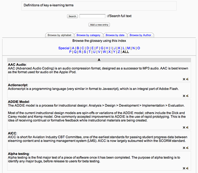
Sometimes we need to explain a concept in conjunction with a procedure, because the procedure only makes sense when the concept is clear. More typically, when we have many concepts to explain we are better off building a dictionary or glossary.
Presenting procedures
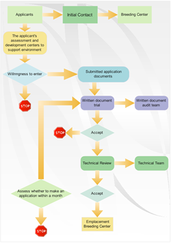
A procedure is a series of rules for carrying out a routine task in a logical sequence. Some procedures are essentially linear: we carry out the same steps each time. Others are conditional: at each step we need to progress differently depending on the particular situation. Linear procedures can be laid out in a simple tabular form, with tips and warnings at each step where appropriate. If you are presenting a software procedure, use screen shots at each step, but only if these are really needed to make the procedure clear. Remember that these will need revising regularly as the software is updated.
Conditional tasks can be hard to explain in tabular form, in which case you could use a flow chart. These too can become complex and unwieldy, in which case an interactive tool might be more appropriate, in which each step is presented in turn, with conditional links depending on the decision made at each point.
Presenting processes
A process is a description of how something works. Processes typically involve a number of stages, with the output of one stage being the input to the next. Some processes, such as the water cycle, are cyclical. Others, such as a disciplinary process, continue until some goal or end point is reached. When users understand a process, they get the bigger picture; they understand how what they do impacts on others.
Processes can be presented in a tabular fashion, but they will often benefit from a process flow diagram of some sort.
Presenting structures
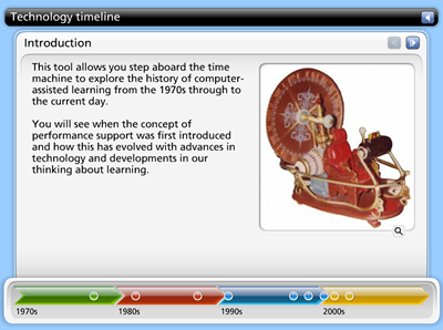
Some information is essentially structural in nature; it describes the ‘parts of’ things, like the bones in the body, the towns in a region, the elements in a software interface, the roles in an organisation chart, the events in a timeline. Unsurprisingly, this information is best presented visually, with each part clearly labelled. You can also configure each element as a link to further information.
Problem-solving and decision making
Sometimes it is not just information that a user needs, but help in troubleshooting a problem or making a decision. One of the most common ways of addressing the former is with an FAQ, a list of frequently-asked questions, but for more complex problems, such as a network fault, an interactive troubleshooting tool is likely to be much more useful.
Decision aids could be structured as a simple comparison table, listing the pros and cons of each option, or more helpfully as an ‘if … then’ list, which recommends a different option for each potential circumstance. A more interactive tool might ask a series of questions in order to narrow down a suggestion to a single alternative.
Coming in part 3: Providing access to your information
